
WhereRemote (Sweden/Austria)
|
WhatWebshop and site design
|
HowFigma, Wordpress
|
StatusCompleted
|
OVERVIEW
Keine Maerchen is an Austrian early-stage startup focused on food and sustainability.
I've worked with the client on another project in Sweden some years prior she started her small business, and we got in contact again when the chance arised for helping her in the work on the website, the webshop and the brand identity with my expertise in the field.
I've worked with the client on another project in Sweden some years prior she started her small business, and we got in contact again when the chance arised for helping her in the work on the website, the webshop and the brand identity with my expertise in the field.
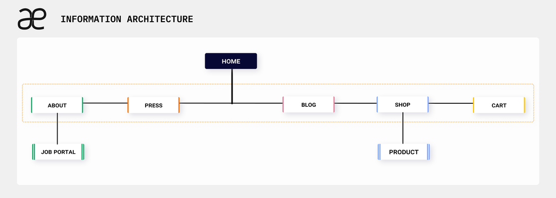
Information Architecture
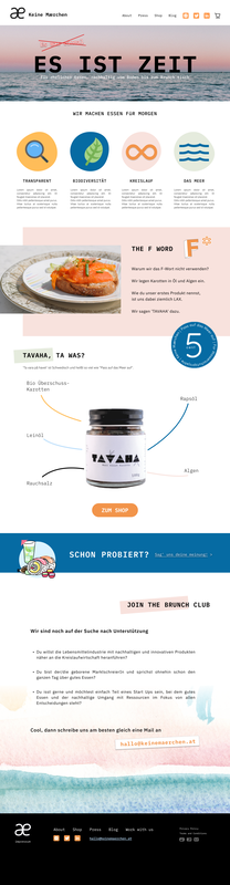
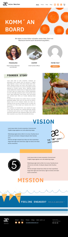
As a first step I sat down with the client and went through the Brand Guidelines, the Identity Moodboard and everything connected with her idea around the company, the vision and the mission. The product and the company goals were set to have a cheerful mood, sustainability and youth vibes, also being very pivoted on the social networks (since the business was fully online, no physical shop).
Eventually I've started setting up the information architecture for the website aligned with the core simplicity of the brand, planned to be more broad than deep as the only second layer of nested pages needed were somewhat handled by external providers (the job portal and the shopping experience).
Eventually I've started setting up the information architecture for the website aligned with the core simplicity of the brand, planned to be more broad than deep as the only second layer of nested pages needed were somewhat handled by external providers (the job portal and the shopping experience).
Building Up the Design System
Due to the colorful and image-heavy brand identity of the company, it was decided to have a simple text-only button instead of using the combo of icon + text that is establishing itself as a standard in webdesign for accessibility purposes. But we solved this by following other accessibility guidelines (e.g. in regard of alt-text) and the much less crowded layout ended up helping in the accessibility of the whole interface after all, thanks to making it much less noisy and less visually intense.
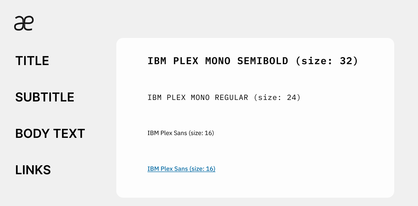
The chosen font was a sans serif (the standard for webpages as it is easier to read) and with sharp, modern lines, to match the brand identity which was youthful and promoted simplicity at its core.
The chosen font was a sans serif (the standard for webpages as it is easier to read) and with sharp, modern lines, to match the brand identity which was youthful and promoted simplicity at its core.
|

|
Building Up the Pages
Upon receiving the graphic assets and the final instructions on the brand identity, it was smooth and quick to finalize the work started with the initial wireframes. The Information Architecture got set into a very simple and linear one with four pages that would serve as a short and sweet presentation of the company leading into the online shop.
|
|
|
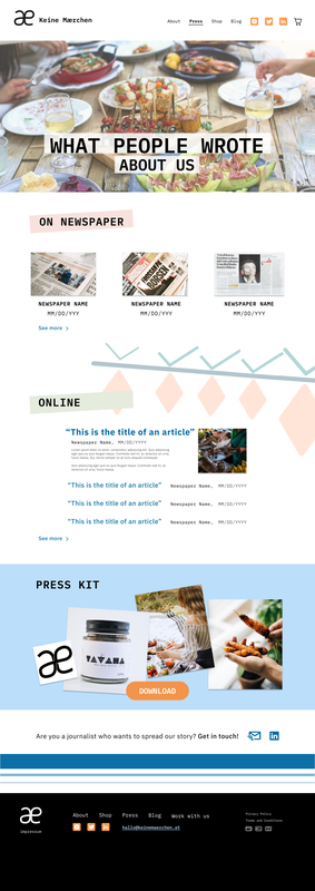
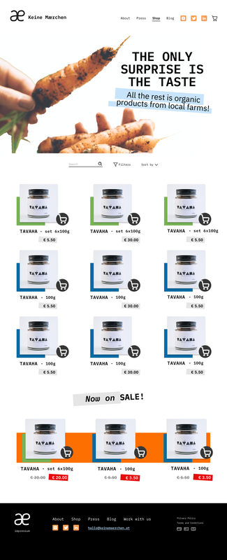
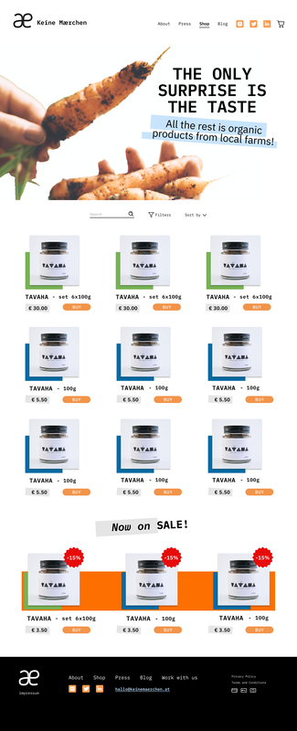
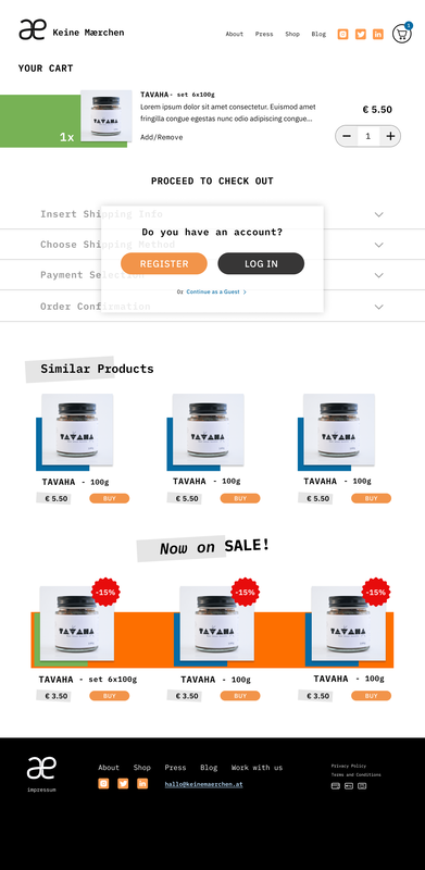
Shop Design
All items in the shop have a colorful frame that gives a quick hint of the type of item that it is. In the example case we have all set of products marked in green, individual jars marked as blue and the row of products on sale is highlighted in orange. The shade of the colors were checked via a color-blind accessibility filter to make sure they would look clear enough for users with different kind of visibility.
The initial idea for the BUY button was to have the icon for the cart for it so that the visual association could be easily done at a glance. The problem with it was that it would end up having a look too diverse from the primary CTA button and therefore could risk to not serve the same purpose that would have been even more important in the shop.
So the primary button was used for the BUY CTA on the second iteration of the wireframes instead, and the text-only button also served to make the whole page less crowded which is best for accessibility.
For the sale tag it was decided to go for a more attention-grabbing upper label stating how much discount was given, so that the red would not be read as a negative signal if put on the back of the price.
|
|
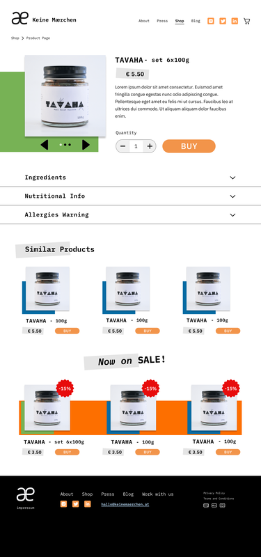
Product Page and Shopping Cart
The Product page and the Cart page follow a similar step-like pattern to make it easy for the user to access different kind of info without making the page too cluttered. The sections are named after each content category and each can be opened and closed fully under the user's control and need. The same system is provided when going through the purchasing flow.
|
|
